
I Had to do Something, You Can Too
to reach out to other humans, to implore them to listen
Dear Parents and Friends,
Vera here (No Way Back, the detransitioner documentary). A few weeks ago we published this CALL TO ACTION for the parents to reach out to decision-makers - teachers, school principals, pediatricians, therapists : https://pitt.substack.com/p/call-to-action
I also wrote that I was in the middle of a Direct-Mail Postcard campaign to High School Principals and High School Mental Health professionals/ counselors / social workers. And we announced our Fundraiser!
First, thank you with all of my heart and soul for your donations! Without your help this postcard mailing campaign would have never happened! Your support is much appreciated!
With the funds, I purchased a mailing list of 20,000 high school principals and high school therapists/psychologists/social workers in 45 states. Your donations helped me hire a professional printing and direct-mail company that gave us the most competitive bid. Now (last week of August and first week of September) they are in the process of mailing the postcards across the US. See the photos below - piles of cards ready to reach their recipients!

The paper 6x6 cards are en route via USPS pre-sorted 1st Class ...🚚🚚🚚🚚 to 45 states of the US.
The postcards will be delivered this week and next.
But I was thinking ....
This awareness campaign would be even more effective if many parents also e-mailed an image of the postcard to their teen's school psychologist and principal with a simple message "Check these projects out!" The recipients might receive both an email and also the paper card. Maybe, just maybe, this will capture their attention.
Another option would be to print the postcard and mail it to your local school board members, other parents, therapists, politicians - any and all decision-makers in the lives of kids. (A few moms are doing this already.)
If you live outside the U.S., feel free to print and mail the card too - both the book and the documentary are available worldwide.
The idea for this campaign was born during a dark deep depression. I simply could not sit still. I had to do something, to reach out to other humans, to implore them to listen. Please help us amplify parents' voices and make the postcard mailing as effective as possible.
Thank you with all of my heart.
Vera (NO WAY BACK, the detransitioner documentary)
We are still taking donations: https://affirmationgenerationmovie.com/donation/
My few bits as a marketing professional and creative director:
A snappy subject line on the email will get more views. Maybe something like "The Mindfulness Tip Every Good Educator Needs."
The text should be punchy, urgent: "Please step back and listen to the other side. It's all I ask." Why is this information urgent? Why do educators need to at least listen to the other side and look at the data? Would they teach subjects that aren't evidence-based? Make it clear that's what they're doing but in a compassionate way — their hearts are in the right place, but their loving-kindness has been abused by the identity politics of theorists. Most of them already know it, you just have to assure them it's okay, that they won't be threatened. Appeal to their respect for knowledge, don't attack.
Do NOT use exclamation marks or other forms of emphasis, like bold, italics and all caps! No shouting in writing — educators, like writers, are sensitive to formatting and punctuation. Your outrage has no place in the mission to get the right information to the people who matter; it's a symptom of the problem, not the cure for it. Keep it here, not out there. You already have the moral high ground and the superpower of being right and on the right side of history. Be resolute and firm; communicate calmly and emphatically.
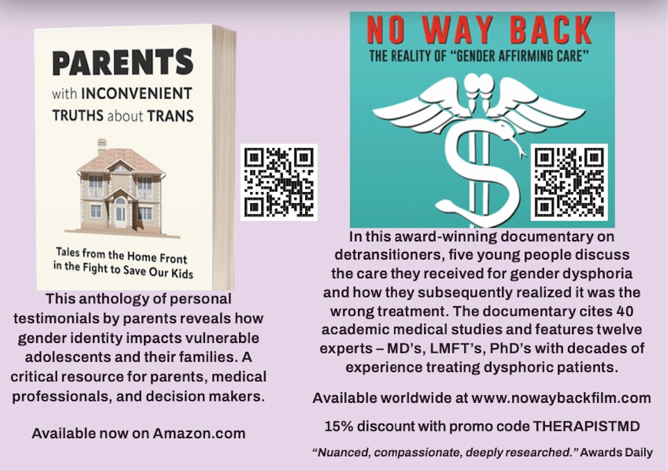
I would separate the graphics of the book and the doc in two distinct paras in the email, doc first. The 'No Way Back' graphic is too weak, the modified caduceus cliché, pointing to nefarious capitalist intentions, which undermines the message and purpose of the email; most people hate being wrong and will go to great lengths to create justifications for what they've supported — see Trumpists and the 2020 election myth that 1/3 of the country believes.
I would embed the trailer from YouTube, assuming there is one, and customize the thumbnail with a screen grab of a detransitioner looking directly into the camera.
The book cover shouldn't be on an angle, just the graphic facing us. No 3-D book effect needed.
The explanatory text for both the book and the doc likewise needs to be punched up to snappy marketing copy, not blurbs. No tiny text, a Verdana set to normal, or 12 pts.
Great, memorable graphics and copy matter far more than most people realize.
God lives in those like you who cannot sit still in the face of evil. 🙏🏽