
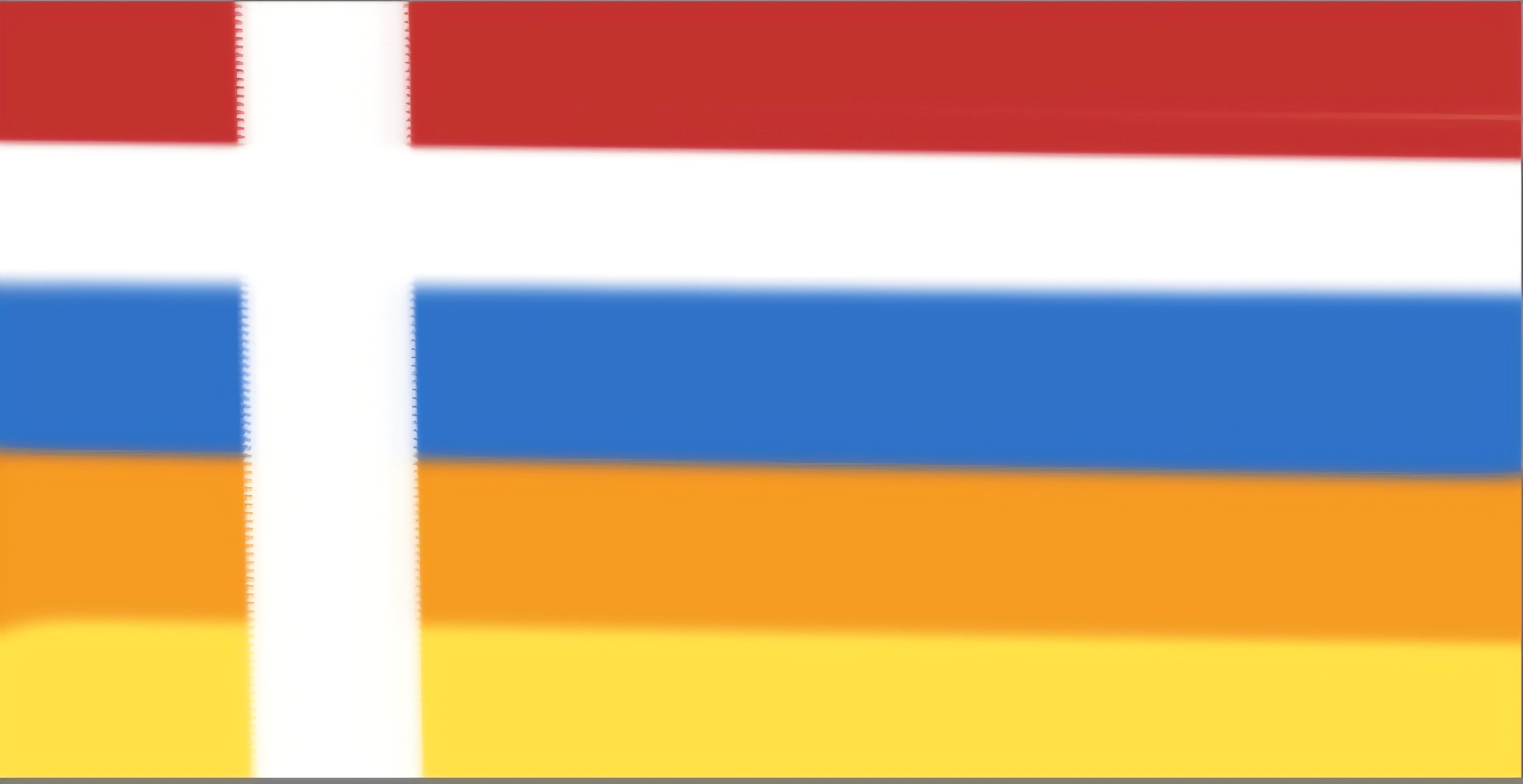
My PRO HUMAN flag
Hi, my dear fellow fighters of the good fight.
In the Art of War, by Sun Tzu, it is written that to be victorious, you need to make a noise as you enter the battle by clanging, banging, singing and blowing the bagpipes and trumpets to intimidate the enemy. Also waving flags and banners to show who and what you stand for.
Well, I designed my own battle flag. A flag with lots of thought and planning in the design. A flag that can be flown to support the human spirit of courage and victory amidst all conflict.
Yes, it is my answer to queer theory, to Marxism, to all things woke, to the praising and empowering of the perverse, to the glorification of diversity and equity, to the estrangement of parents and to cancel culture. BUT instead of it being a direct call for battle, it is more a flag to wave and cheer on as a reminder to remain strong and resilient under all circumstances and to not draw back.
So, it’s my small contribution from the heart, mind and soul to have something to hold onto when feeling defeated.
Please feel free to print this, make badges, share it, wear it and wave it. I am daring to be bold about it, at the cost of sounding vain and egotistical imagining anything can come from this, but either way, here it is... I did it for me and I did it for you and I did for the human condition and strength of our spirit, that is often mocked and derided... for the human warrior that stands for truth against all odds. Now is the time to hold to the truth, be strong and never forget who we are.
Be a lamp unto darkness.
...So, a bit about the flag...
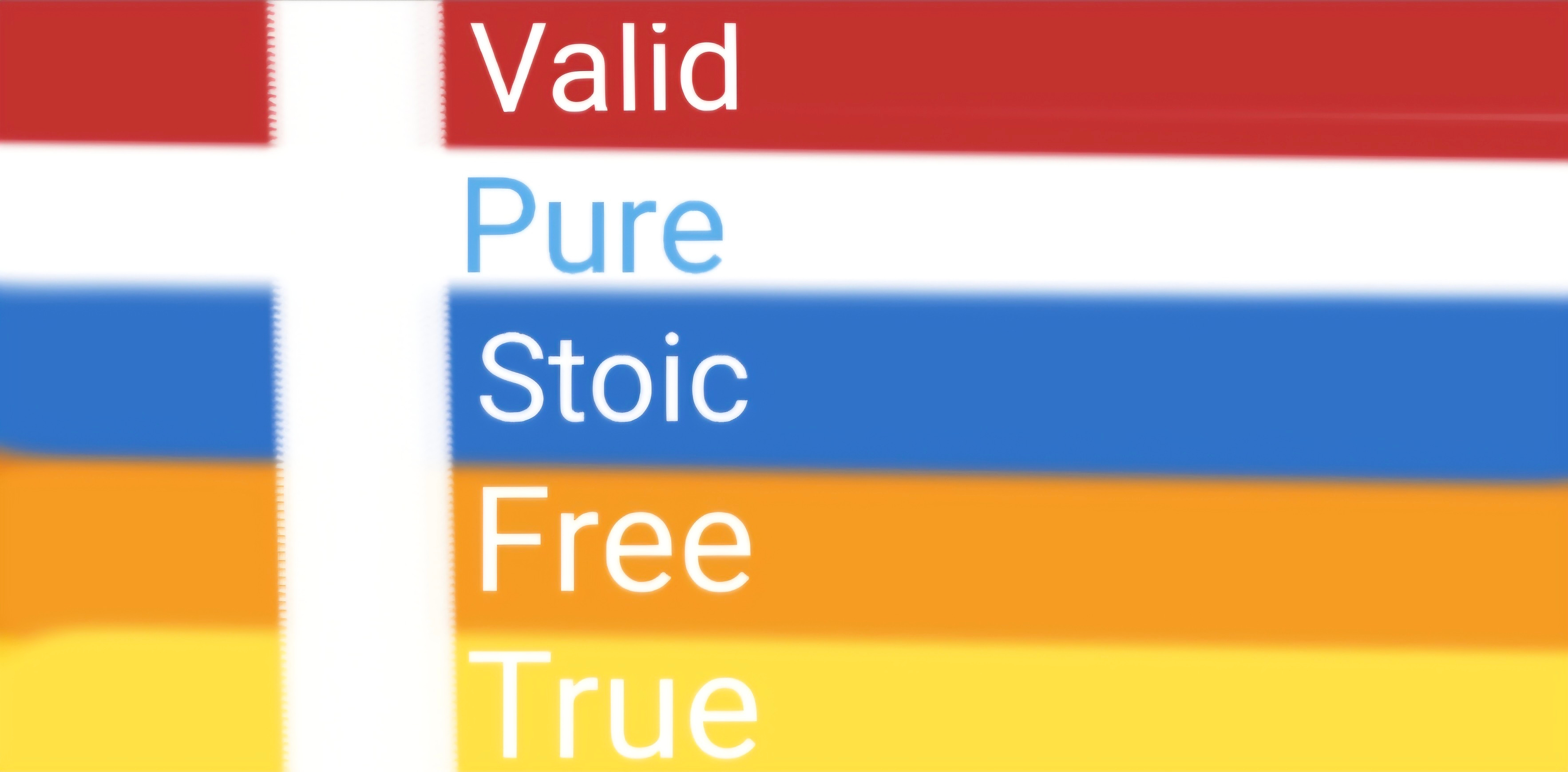
I used Retro colours to stand on the wisdom of Old and to remember where we have come from, but also to firmly stand against modern progressivism.
The Primary colours (except Orange) are to show that we are NOT diluted and weak.
The white Cross for our cornerstone and bold crusade.
The colour choices were all based on universal symbolism, that started with this thought (RED =TRUTH, BLUE = REALITY, ORANGE = OPTIMISM, WHITE = PURITY, YELLOW = ENLIGHTENMENT ), but I needed it to be simple to remember and to flow off the tongue, so with lots of playing around and advice from a wonderful PITT support group, I settled for the colour order simple to remember -RED, WHITE, BLUE, ORANGE, YELLOW and the meaning - VALID, PURE, STOIC, FREE and TRUE, to represent the true and positive nature of the human heart and power within. This is what we should identify as, not a superficial, outer ISM of some kind, but an inner strength that we all possess that when ignited, can overcome any trial.
After spending a few days doing this, I decided for it rather to be about a positive inner change for all, rather than something antagonistic against a group, as much as this IS a battle and I want very much for us to win it, I want us all to see a bigger picture here. Something that we can unite over, not something that sets us at war with our loved ones or that sends a message of hatred and unacceptance to anyone who is lost and confused, who knows, maybe they too can tap into these core strengths and overcome their troubles too!?
So, this is for you to enjoy. I’d be just as happy if nothing more than a small simple pleasure is derived from just reading this substack and having a little win in your heart about it.
This was cathartic for me to do and I needed to do something out of my overloaded cortisol filled, nervous anxious mind.
Enjoy and love you all
So wonderful! Thank you for creating this.
Also, we need a pro-nuclear family flag as families are being attacked and international powers are trying to erase the family!
(Marxism among other ideologies)